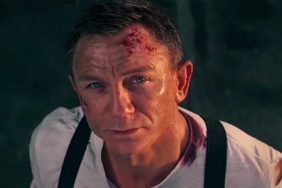
The new James Bond poster is here! It has Daniel Craig on it! And nothing else! He’s just standing there against a plain gray background, not doing anything! James Bond fans rejoice?
Is anyone else bored by this poster? The Skyfall poster, if you recall, was equally minimalist (it was a white background that time), but at least James Bond was doing something (he appeared to be flying through the air while firing his gun behind him). The poster for SPECTRE has no action at all, James Bond is not wearing a suit, he’s not looking dapper, and there are no buxom women draped alluringly across his legs. It looks like a bland publicity photo. Here it is:

Check Out: The Top 11 James Bond Gadgets
This is less a complaint about this poster, but about posters in general; there was a time when movie posters were active, busy, and fun to look at. Take a look at this hand painted poster for A View to a Kill, for instance. Notice its wonderfully weird perspective, exotic setting, popping colors, and action:

Isn’t that cooler? And it’s not even one of the better James Bond movies. Stay tuned to CraveOnline for more news on SPECTRE and James Bond as it comes thunderballing in.
The History Of Spectre, James Bond’s Arch Nemesis:
Witney Seibold is a contributor to the CraveOnline Film Channel, and co-host of The B-Movies Podcast. You can follow him on “Twitter” at @WitneySeibold, where he is slowly losing his mind.
The History of SPECTRE: James Bond's Arch-Nemeses
-
SMERSH and SPECTRE

SMERSH was a real Russian counterintelligence agency from 1943-1946. Its name was an abbreviation of Smert Shpionam, meaning “Death to spies.” In Fleming’s books, SMERSH was still active and themselves a member of a larger international crime syndicate SPECTRE: Special Executive for Counter-intelligence, Terrorism, Revenge and Extortion. Fleming invented SPECTRE in 1959, believing that the Cold War might end and he’d need a villain for James Bond to fight.
Image via Biteback Publishing
-
Thunderball (Novel)

The Ian Fleming books were published in a different order than the movies. Thunderball was supposed to be the first movie, but a lawsuit delayed it. Fleming had actually novelized the screenplay without permission, so McClory sued (and would continue to make claims throughout Bond history). As far as SPECTRE is concerned, the novel introduces Ernst Stavro Blofeld, the head of SPECTRE who is blackmailing NATO with two atom bombs… until Bond defeats him.
Image via Jonathan Cape
-
The Spy Who Loved Me (Novel)

SPECTRE is mentioned by Bond in this book but only to explain why he’s on vacation in Canada; he’s taking a break from Blofeld. The book is about a Canadian motel manager whom Bond rescues from mobsters. Told from her perspective, Bond is a secondary character. The later movie uses only the title and is a more straightforward Bond movie (and one of the best).
Image via Jonathan Cape
-
Dr. No (Film)

Dr. No was the first film starring Sean Connery, after a 1954 one hour TV adaptation of Casino Royale. The movie states that villain Dr. No (Joseph Wiseman) is an agent of SPECTRE. He was a soviet agent in the novel. This affiliation tied into the next film they made, also out of order per the books.
Image via United Artists
-
From Russia With Love (Film)

For cinematic continuity, the plot of From Russia With Love had SPECTRE out for revenge against Bond for defeating Dr. No. Like in the book, Bond must romance a Russian defector to obtain a decryption device, but the motivation was not tied into SPECTRE in Fleming’s novel. The film of From Russia with Love is full-on SPECTRE, of which villains Red Grant and Rosa Klebb are also agents. This movie is the first time we see Blofeld, albeit only as a headless voice stroking the white cat on his lap (which was parodied by Austin Powers’ nemesis Dr. Evil decades later).
Image via United Artists
-
Thunderball (Film)

Goldfinger, which came out between From Russia with Love and Thunderball, was a standalone movie. By the time they finally made the movie adaptation of Thunderball in 1965, SPECTRE had long since established. In the film, Blofeld still doesn’t show his face. Instead, the main villain is Emilio Largo, who is mentioned in the book as SPECTRE’s second in command, should anything happen to Blofeld.
Image via United Artists
-
You Only Live Twice

You Only Live Twice would be the last Blofeld book but again, the movies switched the order. On screen, this is the first time we see Blofeld, played by Donald Pleasance. He’s bald with a scar down his cheek, much like Mike Meyers’ costume for Dr. Evil. The movie also places Blofeld’s lair in a hollowed out volcano, an extravagant location (which would also become tradition of sorts for Bond villains). The book featured SPECTRE characters returning from On Her Majesty’s Secret Service (specifically Irma Bunt), but they weren’t relevant to the film adaptation.
Image via United Artists
-
On Her Majesty's Secret Service

In the novels, this story took place between Thunderball and You Only Live Twice. The movie makes less mention of SPECTRE but it’s all about Blofeld, now played by Telly Savalas. He’s running a clinic in the Swiss Alps. Instead of nukes he’s got a bioweapon that he threatens to unleash unless he’s pardoned for all past crimes. SPOILER ALERT, but the most famous part of On Her Majesty’s Secret Service is that Bond gets married, sincerely and not just as a cover, and his wife is shot in the head by Blofeld and henchwoman Irma Bunt in a drive-by on their wedding day. In the books, this was resolved when Bond killed Blofeld in You Only Live Twice, but since they’d used up that story...
Image via United Artists
-
Diamonds Are Forever

Sean Connery is back as James Bond seeking revenge on Blofeld, now played by Charles Gray with a full head of hair. Blofeld is making lasers out of diamonds and threatening to destroy D.C., but Bond defeats Blofeld for good and is back to his playboy ways. Since the You Only Live Twice novel followed the On Her Majesty’s novel, the original story also brought back Irma Bunt. Bunt is nowhere to be seen in a movie post-On Her Majesty’s Secret Service.
Image via United Artists
-
For Your Eyes Only (Film)

In the early ‘80s, McClory threatened to make a competing James Bond franchise since he owned the rights to portions of Thunderball, including SPECTRE and Blofeld. He eventually succeeded, but to prove to McClory that they didn’t need SPECTRE, 1981’s official 007 movie For Your Eyes Only had a pre-title sequence that’s great in its own right, but especially as a big middle finger to McClory. Bond is trapped in a helicopter controlled by a bald man who is seen only from behind. They never say his name but we know who it is. Bond escapes, takes control of the helicopter, scoops up Blofeld and drops him down a factory smokestack. Neither Blofeld nor SPECTRE are ever heard of in the official Bond films again… or will they both be in SPECTRE later this year?
Image via United Artists
-
Never Say Never Again

This is an unofficial Bond film and no hardcore Bond fans seem to accept it as canon, but it stars Sean Connery and it’s a direct remake of Thunderball, complete with Blofeld (Max von Sydow) working for SPECTRE, and a couple of nuclear warheads. Though directed by Irvin Kershner (The Empire Strikes Back), the film is cheesy as hell and made less money that same year’s official Bond release, Octopussy, starring Roger Moore.
Image via Warner Bros.
-
The Living Daylights (Film)

Though SPECTRE was left far behind by now, there are hints of SMERSH in The Living Daylights. In the pre-title sequence, the new Bond (Timothy Dalton) discovers the text “Smiert Spionom” on some assassins hijacking an MI-6 training exercise. However, in this movie the SMERSH connection is just a decoy to cover up an arms and opium deal.
Image via MGM/United Artists
-
The John Gardner Novels

John Gardner’s James Bond novels have never been acknowledged in the films, and they have certainly never been adapted, but For Special Services does introduce Blofeld’s daughter, Nena Bismaquer, leading a resurrected SPECTRE. SPECTRE was also in Gardner’s novels Role of Honour and Nobody Lives For Ever, which introduced new leaders and agents. Also, a Raymond Benson short story, “Blast from the Past,” features Irma Bunt in a sequel to You Only Live Twice, murdering the son Bond had with his You Only Live Twice Bond Girl, Kissy Suzuki.
Image via Jonathan Cape
-
Quantum of Solace

When the organization Quantum was introduced in Quantum of Solace, it was made out to be the modern equivalent of SPECTRE. The rights to SPECTRE were still tied up by McClory, so it made sense to come up with a substitute. However, on November 15, 2013, seven years after the death of McClory, MGM acquired the full rights Blofeld and SPECTRE.
So if they take advantage of them, if SPECTRE is indeed behind things in SPECTRE, what does that mean for Quantum? It could mean Quantum will become SPECTRE, or that Quantum is simply one criminal enterprise within SPECTRE. Or, again, “Spectre” could just be a metaphor now. Either way, with the books mostly used up by previous films, we’re probably in for a new vision of SPECTRE in the new movie. It seems unlikely that they ever would remake You Only Live Twice or On Her Majesty’s Secret Service, although there’s technically no reason they couldn’t.
Image via MGM/Columbia Pictures
What does the future of SPECTRE hold? We’ll find out soon…


