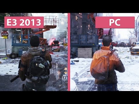
A new video comparing The Division running on max settings on PC and its E3 2013 reveal has highlighted a massive difference in visual quality, with the game’s first trailer looking vastly more impressive than the finished product.
The comparison, posted by YouTube channel CandyLand, places video footage of the game’s debut trailer and its final build side-by-side, with the difference between the two being immediately noticeable. Check it out below:
And here are a selection of screenshots:
Comparison between the vertical slice of The Division at E3 2013 and the final game that has been released 2016 – pic.twitter.com/e2RCnwLIOO
— Nibel (@Nibellion) March 9, 2016
Game footage shown at events such as E3 are usually taken from “vertical slices,” which are snippets of a game that are used by developers in order to garner further funding for their project. As such, they typically look far better than the finished product, given that they are more-or-less built from the ground up to look as visually appealing as possible. This means that the above video isn’t representative of a graphical downgrade, but rather that it’s footage captured from a build of the game that was never going to exist in the first place.
With that being said, it remains frustrating that Ubisoft and other publishers continues to use such footage at events such as E3, given how they must understand that this will only cause controversy further down the line. Ubisoft previously faced backlash due to graphics comparisons between Watch Dogs and its first E3 reveal, and now it looks like the same thing will happen again with The Division, too.


